

16 Jan 11 Mistakes you should Avoid while Making a Print Advertisement
As an advertisement maker we are often tempted to make our print advertisement look stunning, award winningly creative and path breaking. But we forget if an advertisement doesn’t suffice client’s purpose, it has no reason to be made. Here are some mistakes we often do while making a print advertisement that you should avoid.
Too much or too less information
Too much or too less information, both are strict ‘no no’. Many of us wish our advertisements too look absolutely neat, with one creative idea and nothing in it. Many award winning simple advertisements inspire us to do that. But client just don’t like it. He wants you to show his product, talk about its benefits, and display his logo. So make sure you include all important points in your advertisement. On the other hand don’t overstuff your advertisement with too many communication elements making it ugly.
Too many colors
We often think too many bright colors easily grab attention. But too many colors also look repulsive. Don’t use more than two or three colors. Colors should complement each other.
Too stylish and illegible font
Don’t fall in love with fonts that you don’t even notice its drawbacks. Don’t use too stylish calligraphic fonts in your advertisement, they are mostly unreadable. People won’t give an extra effort to understand your advertisement. Keep your font simple, bold, classy yet readable. Don’t use too many types of fonts either. Use one or two types of fonts. Concentrate on font size too. Headline, subhead, body text everything should bear distinctly different font sizes.
Logo larger than life
Often we place brand logo in center of the advertisement, large and really loud. Don’t scream too loud. Often client may ask you to emphasize the most on his logo. But too much emphasized logo won’t not only make your advertisement look ugly but also remain avoided. So keep it visible but not in center of attention.
Next time, you make a print advertisement don’t make these regular mistakes. These tips will help you to overcome these commonly committed mistakes. All the best!
Tags: Advertisement, Advertisements, Brand Logo, Bright Colors, Calligraphic Fonts, Center Of Attention, Communication Elements, Concentrate, Creative Idea, Font Sizes, Larger Than Life, Love, Pri, Scream, Three Colors, Ugly
02 May 10 Credit Card Reform Wrong footed the US Consumers
Credit card reform was one of the many steps taken by Pres. Obama to pull the US economy from the ugly jaw of recession that engulfed many innocent families taking away countless many jobs. People were cheerful about it, but now as the promise had been acted upon and the law has been put in place, people are not cheerful. People are confused, angry, and ambivalent about it, as found by the Nielsen Company in a study.
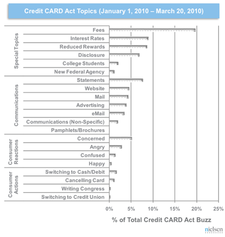
Nielsen BuzzMetrics has done a thorough study to gauge the mood of the consumers, and for that the company sieve through 45,000 Usenet forums, 8,000 discussion forums, and 135 million blogs. According to the Nielsen Company, the main focus was on finding the following:
- How are consumers reacting?
- How are card companies communicating changes?
- What actions do consumers plan to take?
- Who is to blame?
- Which companies are being implicated?
The study revealed that buzz related to Credit Card Act tipped off big time in May 2009, and it continued making round until it petered out n February 2010, when the law was put into effect. (See image for trend).
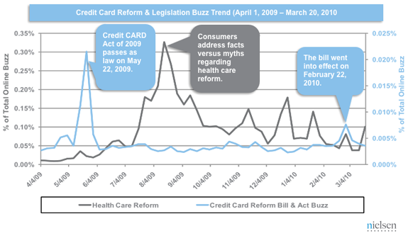
People who went gaga on the announcement of Credit Card Act 2009 started to oppose it when Obama signed the bill to make it a law. People have many complains ranging from having not enough protection to fear of misuse by the company, etc. Only time will tell how justified this fear is, meanwhile see the image below to get the complete data.
Tags: Act, Big Time, Buzz, Consumers, Credit Card, Discussion Forums, Economy, Gauge, Image, Innocent Families, Jobs, Nielsen Buzzmetrics, Nielsen Company, Obama, Promise, recession, Sieve, Ugly, Usenet Forums

